AnArstyBlackGirl

"What Does Alienation Feel Like?"
For my final project at university, we were instructed to create a body of work that would respond to a question that we had to pose ourselves. The question I created was "What Does Alienation Feel Like?"
I chose this topic because it was something that I felt confident to tackle; I had felt alienated throughout my entire time in Farnham, my university town, so I felt that I had enough personal experience to draw from to make the project feel sufficiently investigated.
With help from tutors and family, I was able to produce a colourful and varied body of work that I am proud of, and which earned me an A grade.
Altogether, the work I created to present on my university's online graduate showcase and at its physical graduate exhibition was: an A0 sized poster, a booklet with self-composed poems and illustrations, a wearable "Combined Mask" and a frame-by-frame lyric animation with self-composed music. I also created themed business cards as an extension to this project for the sake of networking and establishing a unique brand for myself.
Overall I'd say I enjoyed the creative process quite a lot, which was why I was able to produce an extensive list of outcomes (alongside being passionate about the topic at hand). I am especially grateful to everyone who helped me and gave me ideas throughout this process, as I know my outcomes would have been bland and uninspired without it.


Outcome 1/4:
Alienation Lyric Video
This was my initial design for the alien character that I wanted to represent myself. During early tutorials, one tutor suggested I take my hairstyle (locs) and use that as a feature that makes me seem 'alien' because of its unique shape and look. I liked this idea because I thought that a creative way to make myself seem like an alien would be to make the thing that made me unique, my hair, the thing that also made my alien an outcast (though in the form of antennae).
Later, another tutor suggested that this character sheet made my alien look fierce as opposed to passive and anxious, which is how being alienated made me feel, thus felt the design was not fitting for the message I was trying to convey. However, I was quite attached to this character design because I felt it represented me well. Therefore, I kept this design on the back burner and planned to use her for something else, not wanting her to go to waste.
During the process, I was given a task to create a response to Young-Hae Change Heavy Industries' pieces, which prompted me to create a similar frame-by-frame animation focusing on the way words appeared on the screen. In my response, I chose to scatter in a few illustrations to make the visuals more eye-catching and to provide an image of what I was trying to verbally convey. My lyrics were created based on my reflections and feelings about attending my university in an area lacking in diversity, and how I felt I couldn't wholly communicate and fit in with my peers. The instrumental playing in the background was self-composed in 2021, and I chose it because it's upbeat. This, along with the pastel-coloured lyrics and illustrations were intentionally constructed to look cute and innocent to further juxtapose the melancholy of the content.
I got a positive response to this prototype when I presented it to peers and tutors in group critiques, so I decided that a part of my outcome would be an upcycled version of the video, however, this time it would be the full song with more polished typography , better timing and more cohesive illustrations. I knew this would be a bit challenging as each frame was saved syllable by syllable, but I wanted to do my best for my final project and make sure my work was the highest quality it could be.
As the main purpose of my video was to be as personal and descriptive of my experience as possible, I ultimately chose to exhibit my alien character in it because, as mentioned, I felt quite connected to her design and what she represented. Presenting myself as an alien to depict my feelings about alienation is quite an obvious approach, however, I wanted the audience to be able to clearly understand how outcasted I felt at uni. Moreover, the obvious visual depictions complemented the emotional lyrics as I feel these factors made the video feel raw and authentic.
I was ecstatic when I finished this outcome; I felt as though everything had turned out as I'd envisioned, which made me really happy. As a perfectionist, I felt there were a few minor issues with the timing, but I was proud of myself for creating what I'd set out to; a fun, dynamic video with contrasting, emotional, meaningful lyrics. I'm especially grateful that my iPad didn't give out on me with the 400+ frames that I had to save and edit into iMovie individually. Altogether, this outcome took me ~6 consecutive days to produce from scratch, with the instrumental itself taking about 4 hours when I composed it 3 years ago. It was an intense yet rewarding schedule.
Outcome 2/4:
The Combined Mask
When I was stuck for ideas as to how to present what alienation feels like, my tutor suggested I create a series of 9 masks to depict the different faces of alienation, then present them on a poster. She suggested 9 because this number would create a grid formation on the poster. I really liked this idea because I felt it would allow me to fully flesh out the multiple ways I responded to feeling alienated. The main idea was to create 9 distinct masks, each with a unique way I would act/ react as a result of feeling alienated.
Following this, I came up with these concepts: The Party Mask, The Jester Mask, The Makeup Mask, The Balaclava, The Theatrical Mask, The Masquerade Mask, The Broken Mask, The Kitsune Gas Mask and, finally, The Hair Mask. When I'd finished outlining the purposes of these masks, I also came up with the idea to have a final Combined Mask, in which an element from each mask would be taken and combined with one another to create a final mask. The idea was that it would look clunky and overwhelming to visually represent how overwhelming it is to keep up all of the facades at once. It was intentionally crafted to be an eyesore to represent how unnatural it is for me to be acting so out of my character in an attempt to fit in and seem normal and likeable.
1) The Party Mask:
-
For the Party Mask, I wanted it to have a recognisable and flashy silhouette to represent how I try to turn up my personality and act more ‘bubbly’ and outgoing when thrown into a new atmosphere with people I don’t know.
-
I wanted the mask itself to be eye-catching in both shape and colour to represent my efforts to also seem like I’m fun to be around so that I don’t fade into the background and become someone that no one knows or wants to speak to.
-
I also purposely designed the mask to only cover half of the face to represent how cautious I am of seeming too ‘full-on’, putting on a measured act as opposed to a completely false one so that my personality does not seem overly fake, unnatural and unappealing, consequently driving people away.
-
Before colouring the masks, I knew that I wanted to use the same palette as I did in my Alienation video so that there would be as much connectivity as possible in my outcomes. I wanted people who viewed my work (at the graduation show and elsewhere) to be able to identify the work as mine and under a single project. Thus, I stuck to shades of pink, green, yellow, black and white to colour my masks.
-
I wanted the Party Mask to be brightly coloured to suit the false bright and bubbly personality I put on to try and make friends. I experimented with green for the main colour of the mask, but ultimately preferred yellow because it was the brightest colour in my palette.
-
I added music notes to the design to represent the small detail of me altering and pitching my voice to sound more engaged and friendly. The feathers add an additional flair that stand out from the silhouette, representing my desire to stand out and be seen as desirable to have as a friend.
-
I also added eyelashes to the mask to represent ‘putting my best foot forward’ while trying to make friends, in the same way I often use makeup to look my best any time I leave my house.
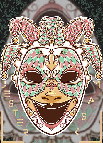
2) The Jester Mask:
-
For the Jester Mask, I wanted it to look slightly unconventional to represent the odd jokes I sometimes make in an attempt to be seen as funny (which are most likely just seen as purely unconventional).
-
I designed the mask so that it covers my whole face to represent how this persona– being an entertainer who is constantly jovial and able to crack jokes– is completely unnatural to me and not how I truly am at all (unless I’m around my sisters). The full covering is a desperate attempt to conceal my insecurities of being perceived as boring and a representation of how much effort needs to be put in to seem like I’m not.
-
I also liked the bits of the headgear that extend from the mask and felt the need to implement them into my designs because they look like they are jumping out at the viewer, similar to how some of my jokes may come across as offbeat and too direct/ weird. It also represents how much I am stretching and over-exerting myself in this mode in an attempt to be seen as funny and, therefore, valuable.
-
I quite like how the Jester Mask turned out, especially because the colours were somewhat unintentional (particularly the white areas, as I had not previously considered adding large amounts of white to my masks).
-
The dark and gaping eyes and mouth successfully contrast with the otherwise pastel palette, making the mask look slightly unnerving, which I like. This works well with my intentions of displaying how unnatural this mode is for me.
3) The Makeup Mask:
-
For the Makeup Mask, I was initially heavily inspired by the masks used for Pretty Little Liars’ posters, particularly with the cracks shown. I thought this very successfully communicated the idea of having a breaking/damaged façade that is becoming difficult to keep up. This is similar to how I feel; no matter how much makeup I wear, or how I style myself, I feel as through there are cracks in the image I put up, causing me to fear people seeing through me and looking like a fool.
-
I then gravitated towards doll-like makeup because of resonating with terms like getting ‘dolled up’ in an attempt to look as put together as I can so that I’m not viewed as ‘unkempt’, giving people more reasons to stay away from me. I wanted this mask to look conventionally pretty but with very evident damage to create a contrast and a sense of confusion; the beauty beneath the cracks is recognisable (representing my visible efforts to look presentable), but the cracks are so distracting that the efforts are unfortunately wasted anyway.
-
The doll-like features are exaggerative (e.g. the huge eyes and unnaturally long eyelashes), which was intentional to make the face look slightly unsettling with how much makeup had been slathered on to conceal the natural features as much as possible (due to feeling like my natural features are an additional factor that separated me from my peers).
-
I added cracks extending from the facial features such as the eyes and mouth to emphasise how dangerously worn out this mask is becoming, as self-consciously dressing myself in a certain way is a tiring and daily ordeal for me.
-
Originally for this mask, I wanted to keep it monochromic and pink because pink is representative of femininity, and so is makeup. However, upon running a few colour tests, I found that I liked the look of the yellow mask I experimented with. I liked the warmth shown in the skin because it felt more life-like, linking to how realistic I would like this façade to seem to onlookers.
-
However, I felt that the monochromatic yellow blush I originally tried sucked some of the life out of the skin and muddied the mask (which is why I didn’t use any green for this one), so I combined the pink makeup with the yellow base to create a more lively looking and colour-balanced mask.
4) The Balaclava:
-
I struggled a bit with the balaclava thumbnails because I felt that the references available were limited. Moreover, I wanted the mask to look overtly intimidating whilst having small details that would add to this characteristic without becoming overly decorative or tacky.
-
I settled on the current design because it was simple and concealed enough of the face to create an unsettling feeling. Its simplicity also allowed me to draw an embroidered pattern on it which would be the minimal detail that would help to emphasise the menacing air I was aiming for it to exude. I also thought it looked intimidating due to the angling of the eyes; the upwards tilt give it a more aggressive and angry look.
-
At times, my feelings of alienation get the best of me and I feel overwhelmed by them. I find myself putting on a stoic demeanour so that this will not be recognised and so that I can be left alone to process my feelings. This is the significance of the Balaclava and particularly my desire for it to look menacing; it’s to demonstrate this more extreme reaction in response to feeling alienated.
-
I also felt that the increased amount of covered skin added to the menacing look, due to the extended efforts to conceal my identity.
-
I opted for an embroidered thorny rose on the side of the balaclava because I thought that the thorns of the rose were subtle, but still worked well with looking intimidating.
-
I initially designed the mask to be black, however I also wanted the poster for all of the masks to be black and I had concerns that this would blend into the background and be hard to see. Thus, I changed the colour to yellow because pink seemed too feminine and positive and green didn’t have the right meaning for me.
-
Yellow can represent caution, like warning signs. I liked the idea of the mask serving as a red flag to drive people away and also as a sign that I am not doing okay and I am isolating myself.
-
I made the details black because it represents darkness, and I think this represents the idea of intentionally isolating myself and attempting to get people to stay away from me because I’m afraid of them isolating me first.
5) The Theatrical Mask:
-
The Theatrical Mask represents me being dramatic when speaking to seem more interesting. This is different to the Party Mask because that one is specifically for when I’m trying to make new friends, and my personality is more measured in that scenario. For this mask, it is for the purpose of engaging people in any situation; with friends, tutors, strangers– it could be anyone. Feeling inadequate in terms of my social value and a lack of belonging sometimes causes me to be exaggerative in my expressions and gestures in an attempt to engage my audience more and hopefully be seen as fun and interesting enough to keep around.
-
With this, I wanted the Theatrical Mask to show very dramatic facial expressions, warped by ridiculous attempts to seem entertaining and be engaging. It was also important to me to have both the positive and negative expressions to represent how I may flip between acting manically excited and dramatically downcast. I wanted the expressions to be exaggerative to represent how, to me, it’s nothing but exaggeration. I liked the idea of combining the masks so that it could seem warped and communicate just how unnatural this mode is to me. The mask would also be a full-faced one for the same reason; in a bid to conceal my reserved personality beneath it.
-
I made the mask multicoloured (within my palette) to represent my constant flipping between emotions when exaggerating in a conversation. I kept experimenting with ways of warping the colours to suit the spiraling eyes and the idea of going mad with frantically trying to keep people engaged.
-
The end result of this mask looks unhinged, which I am satisfied with, because that’s how it feels to keep up the charade of being more exciting than I actually am.
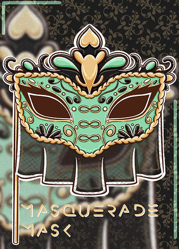
6) The Masquerade Mask:
-
The purpose of the Masquerade Mask was to conceal any signs that I am not well-off or well-kept. It is similar to the Makeup Mask in that it’s purpose is to beautify and conceal, however, this mask has the specific purpose to make me look more financially and materially fulfilled than I am. I am not poor, however I do find myself constantly putting in efforts (such as the way I style myself) to make myself look well put together, fearing someone seeing me in a (more natural and casual) state where I look less than desirable. My fears are that if I look dishevelled, people will have more of a reason to not approach and, consequently, ostracise me.
-
With this in mind, I designed the Masquerade Mask to be decorated with intricate details and swirling designs with rhinestones to represent wealth and extravagance. I wanted the eye shape to be cat-like because it looks sleek and tapered, which I think adds to the concept of looking elegant.
-
I designed this mask to be held up with a stick to represent how my efforts to keep this façade up are strenuous and hands-on because it’s not natural to me. Thus, a continuous and constant effort must be put in in order to maintain this image i.e by constantly holding the stick.
-
I wanted to incorporate the tiara design to reinforce the ‘rich’ façade and the efforts made to look extravagant. I added a veil as it, too, looks fancy. It links to how, in earlier time periods, the rich would cover their skin in an effort to look pale so they could avoid looking like they worked in the sun (because they were too wealthy to need to do so). Having a veil also adds a hint of mystique as, often, celebrities and powerful figures conceal their faces in public because of their status. Going to these lengths to conceal my face represents an effort to also seem well-kept and important.
-
The colour scheme was kept the same throughout my colour tests because these colours held significance to me. Upon researching, I found that green is representative of envy, which I thought was incredibly fitting for an image surrounding wanting to appear elegant. Feeling alienated has, indeed, caused me to feel envious of others for things as seemingly insignificant as their ability to create art in diverse mediums. Thus, I used green as the main colour of the mask to highlight that this façade is so glaringly imbued with envy.
-
I chose yellow/ gold for the trimmings because gold is associated with wealth and yellow can be representative of cowardice; it is cowardly to hide behind an image of riches and false confidence as opposed to accepting myself as I am and working on my shortcomings.
-
Black simultaneously represents wealth, darkness and power, which is why I used it particularly for the tiara and veil. The veil has its opacity lowered, however, which represents the difficulty in maintaining this image because of how far from reality it is; it is a visual representation of my ‘thinly veiled efforts’.
7) The Broken Mask:
-
The Broken Mask is representative of barely keeping my facades together. Although it may seem strange to want a mask to represent any form of brokenness (as the running theme is that I’m attempting to conceal all flaws), I think this mask successfully works as some sort of SOS signal, like a last ditch effort to appear composed when, in reality, this is not the case.
-
I was inspired by Phantom of the Opera masks and other incomplete masks because they portrayed a damaged façade in which my face would be shown. In reality, I do not always have the strength or will to put on an act, and mask minimally so that I can avoid complete isolation while preserving my energy.
-
I wanted the silhouette of the mask to have goopy and fluid shapes to make it more unique (as the mask itself has a unique purpose that somewhat opposes the others) and to stray away from the stereotypical ‘jagged, broken shards to represent brokenness’. Sometimes, to me, brokenness and isolation feels muted and draining, not sharp and aggressive. The fluid shapes represent a worn out and melting façade, linking to how maintaining any sort of image feels draining and my efforts and attempts are slipping through my fingers.
-
I decided to go with this design because I liked the idea of using things that are seen as beautiful (and natural)– such as flowers and butterflies– to patch up the parts of the mask that are melting and breaking apart, in order to overcompensate and maintain an image of beauty and wellness in a ‘natural’ way.
-
The reason why I chose yellow as the base colour is because it is representative of cowardice. Like the Masquerade Mask, desperately hiding behind a breaking mask instead of being honest with myself feels and seems cowardly.
-
Green can be representative of new beginnings and growth which, although it suited the visuals of the mask with the blossomed flowers, completely contrasted with the meaning behind it.
-
Green also represents a lack of experience, thus I thought it would be appropriate to scatter it on the mask to represent my lack of experience with dealing with such intense feelings of brokenness and lack of belonging.
8) The Kitsune Gas Mask:
-
Whilst I was generally researching types of masks, I came across Japanese Kitsune masks. I thought some of them looked really cute and I wanted to implement their design into my outcome. I researched their meaning to see if their significance would be relevant and found that, in Japanese folklore, the kitsune is a fox with shapeshifting abilities. I was happy to discover this because shapeshifting and masking are very similar, especially as the purpose of my masks was to appear like I was someone that I definitely was not. With this, I sought to combine the kitsune mask design with another mask so that I could reinforce the notion of shapeshifting to avoid being isolated.
-
Ultimately, I decided to combine the Kitsune Mask with my Gas Mask designs. This is because gas masks look quite harrowing and kitsune masks look quite sweet and fun; like something out of lively festival attire. Together, the two designs were quite contrasting and I liked how the bulging, soulless eye pieces of the gas mask looked against the girly bows and tassels of the kitsune mask.
-
The purpose of the Gas Mask was to filter my speech; I grew up speaking East London slang, which I typically use from time to time and occasionally to enhance my humour. However, I had/ have fears that the people in my university's area would not understand my ways of communicating and would misconstrue my speech, especially when conversing with international students. As a result of this, I found myself heavily monitoring and readjusting my speech so that I was not looked at as weird or difficult/ frustrating to communicate with.
-
With this, the Gas Mask would help me to filter my speech and ensure I speak the same way as my peers, to avoid any awkward or embarrassing hiccups. Combining a gas mask with the kitsune was successful because the shapeshifting elements of the kitsune strengthens the idea of shapeshifting into someone who speaks just like everyone else and, thus seems ‘normal’ and approachable.
-
I struggled a bit with the colours for this mask. I wanted to keep the colours pastel to represent my attempts to use ‘proper’ speech to seem more approachable, however, I felt that the yellow and light pink clashed and looked unappealing. I guess this could have worked in the sense that the way I speak may seem unappealing to others, however, I wanted this to show in the mask’s design itself and not its colours.
-
I kept the yellow minimal and replaced it with black and a darker pink instead, as these colours were more harmonious with the lighter pink. The bits of black added a bit of darkness, which matches the darkness within the idea of doggedly attempting to filter your speech– something that should flow naturally– to try to fit in.
-
I think that the idea of my natural, unfiltered speech potentially being toxic to my social standing (and consequently killing it) is also quite dark.
9) (Finally) The Hair Mask:
-
For the “Hair” masks, I chose to sketch hairstyles that I frequently wear so that there could be more representation of myself within the final piece besides any depictions of myself as an alien. I purposely chose styles where my hair was up and spread and in my face so that I could further emphasise the notion of wearing hair in a unique way in order to seem more mysterious and/or interesting.
-
The rounded shapes I used to draw the hair helped to create a distinct silhouette, which I was aiming for because I wanted the emphasis of the masks to be on their shapes rather than their colours. This was because I wanted the very clearly differentiate between the functions of each mask, which would be visible first and foremost through their shapes and silhouettes.
-
I chose to draw the hair by without any extra (facial) features so that I could communicate the message of ‘hiding behind hair’ (and having it be your entire personality) clearer; the better I visually communicate this idea, the higher the chance audiences receiving it and empathise with what I am saying.
-
For the hair colours, I kept them light and closer to the warmer side of the colour wheel, because I didn’t want to pick a colour that I thought would look too odd and cause me to be alienated for trying too hard to look unique (such as green).
-
Ultimately, I settled on the blonde because it’s representative of my real hair, serving as a realistic representation of how I respond to feeling alienated in reality. Moreover, I had concerns that people viewing my work in the graduation show may be confused upon first glance as to what this mask was supposed to be; picking a natural-looking colour would help better visually communicate my ideas and help them understand what I had drawn.
-
Finally, this mask has quite a distinct shape as it is a head piece rather than something that covers the face. I noticed that a lot of my pieces were yellow/ gold, so keeping the colour uniformed would help the mask to blend in a bit more, while remaining unique solely because of its silhouette.
Final Mask Conclusion:
-
Altogether, for the final Combined Mask, I wrote a list of particular features I wanted from the 9 masks so that I could collage them. I chose the features according to what I thought made the individual masks unique, what I thought their most important element was or what would enable me to make the final one look face-like. The features are as follows:
-
The feathers from the Party Mask
-
The forehead from the Jester Mask
-
The left eye from the Beauty Mask
-
The neck from the Balaclava
-
The nose and left eyebrow from the Theatrical Mask
-
The veil and stick from the Masquerade Mask
-
The right eye from the Broken Mask
-
The filters from the Kitsune Gas Mask
-
The left pigtail from the Hair Mask
-
I struggled a bit with including the Theatrical Mask because the eye slots (which I thought was its most prominent feature) were already taken by the Makeup and Broken Masks. I settled for the nose and left eyebrow, which added subtle touches, though I felt they successfully added some finishing touches to the outcome.
-
I was quite happy with how it turned out after a few experiments, and I was especially pleased with its silhouette, because even though its quite busy, it still very much looks like a wearable mask.
-
I also like how the features worked in harmony and were still recognisable without overwhelming one another. The Combined Mask looks as unsettling and overwhelming as I wanted it to.


Outcome 3/4:
The Illusion of Inclusion-- Poster
Creating the poster was probably the easiest part of this project as it simply relied on my ability to organise the pre-made masks on the canvas.
The title was a nod to how this entire project was about how it felt to feel alienated, so putting on masks was a way of my efforts to/ making myself feel like I was being included.
I did a few formation experiments, with the yellow-heavy masks being in the corners while the Hair Mask was in the middle. Although I was happy with this due to the colour balance, my tutor suggested I rearrange it so that the middle wouldn't have such a gaping hole in the centre, left by the hair not being attached to a face. She also suggested I create a black and white version of the posters, as shown. I personally prefer the black background as I feel it provides a better contrast between the brightly coloured masks and the background.
My original plan for this poster was to have the names of the masks just above or beneath them with a short description about them, but when I'd finished organising them on the canvas, I realised there would be no space for this at all. Additionally, with the masks all being different shapes and sizes, it would be hard to get a consistent line of text for the names, unless I shrunk the masks down and possibly put them into boxes for uniformity's sake. This posed its own challenges, however, because I was concerned that this would jeopardise the intricate details on certain masks like the Masquerade and Jester Masks. Even though I had plans to have the poster printed at A0, I was still concerned for how the pieces would look on a smaller scale and in a digital space. I’m happy I faced these issues, though, because this led me to innovate and come up with a solution to this; the final part of my outcomes.
Outcome 4/4:
The Illusion of Inclusion-- Booklet
Onto the final part of my project, which was probably my favourite to work on; the Illusion of Inclusion booklet. I liked working on this the most because I found it fun to create somewhat cryptic poems about the masks and how they came about as a result of my feelings behind them. I enjoy coming up with poems, as I feel I have a lot of "dang, that's sick" moments while coming up with words that simultaneously rhyme and have depth to them. I felt the same way as I was writing the lyrics for the Alienation video.
It was also nice to know that I was enhancing my project whilst not having to draw an overwhelming amount of illustrations to do so. Like with the poster, all I really had to do was organise the masks of the pages with the poems and their titles, which was much less tasking than having to illustrate something new to enhance my project.
The main purpose of creating the booklet was to give some context to the masks I created; it was all well and good to have them on a poster, but I felt they needed to be spotlighted more and explained so that audiences could really understand that they were responses to feeling alienated. As seen by the copious amounts of information I have written about them above, they each had an ample amount of context and I had a lot to say about them. Thus, I decided to come up with poems describing each mask and their purpose. I made sure to label them so that audiences could identify them and, hopefully, remember them better. One of my aims for this project was for it to leave a lasting impression, and having identifiable features within my outcomes would help to make that happen.
As I knew the booklet was going to be exhibited at my university, I also made sure to include a QR code linking to my Alienation video to further connect my whole project (which unfortunately doesn't work anymore, but you can find the linked video here).
I designed the covers to have curtains on them because I wanted to communicate the idea of getting a peek into my mind (as my project was my perspective on feeling alienated), and exiting, hopefully, with an impression left. I added the unsettling Combined Mask right at the end as I thought this would aid in making a lasting impression. Also, it just happened to help me hit my page limit.
I used the same space font across all outcomes to help create a link between them beyond the colour palettes. I l liked how this creates a sort of house style for my projects because it made it look more uniformed altogether.


Thank You!
Thank you for taking an interest in my art! If you'd like to collaborate and commission me for similar work, please feel free to email me at:
Please note that, depending on the factors you require, prices may vary to what is stated in my commissions information. Thank you!
